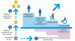
What is Universal Design?
Universal design in the broadest sense is the design and composition of an environment so that it can be accessed, understood and used to the greatest extent possible by all people regardless of their age, size, ability or disability. This takes place most noticeably in the physical world, with building and public design, such as making sure buildings have sliding glass doors and elevators. There are 7 principles of Universal Design:
- Equitable use; meaning that the design is useful and marketable to people with diverse abilities
- Flexibility in Use
- Simple and intuitive
- Perceptible information
- Tolerance for error
- Low physical effort
- Size and space for approach and use
Yet, the conception behind universal design applies to more than the physical world, and benefits more than those with limited abilities. In fact, many of the laws referenced in What is Digital Accessibility lead into making sure that designs are universal.
Who Benefits from Universal Design?
This question’s answer may seem obvious– those with disabilities. This is certainly true, those with disabilities may benefit from universal design in all aspects of their lives. In fact it is frequently designing for those with disabilities that universal design is actually achieved. Disabilities, because of age, size, illness, or injury forces innovation and flexibility. But don’t be fooled, there is a reason that it was named universal design. When true universal design is achieved– everyone benefits regardless of ability level.
 This seems readily applicable in the physical world, but just as important in the daily lives of all people is the digital world, and though a shift in detail is needed, the basics of accessibility and universal design underneath stays the same.
How does this apply to the Digital World?
In the digital world universal design means making the digital environment as accessible as possible for everyone; so that information, programs, websites, and such can be used by the widest range of users. This sounds really hard, and sometimes it does require customizing code for websites and such, however keep these web accessibility principles in mind and it’ll work out:
- Provide Alternative text for Non-Text Content
- Provide Appropriate Document Structure
- Provide Headers of Data Tables
- Ensure Users can Complete and Submit all Forms
- Ensure that Links Make Sense Out of Context
- Caption and/or Transcripts for Media
- Ensure Accessibility of Non-HTML Content
- Allow Users to Skip Repetitive Elements on the Page
- Do Not Rely on Color Alone to Convey Meaning
- Make Sure Content is Clearly Written and Easy to Read
- Make JavaScript Accessible
- Design to Standards (HTML Compliant, Cascading Style Sheets)
Following these principles, at least to some extent, is very easy depending on the website or the software you are utilizing. Such as this blog post; all headings are formatted with the Headings drop down above, all lists numbered and bulleted are using the list button above, all links are (hopefully) understandable outside of context, and the image above has caption, title, and alternative text with it. It doesn’t take long to make sure these things are part of the page, but it can make a huge difference to readers and their ability to use assistive technology efficiently and effectively.
 This seems readily applicable in the physical world, but just as important in the daily lives of all people is the digital world, and though a shift in detail is needed, the basics of accessibility and universal design underneath stays the same.


Jennifer Dowling
Excellent, informative blog — keep up the good work!