The UNT Scholarly Works collection is home to materials from the University of North Texas community’s research, creative, and scholarly activities. To encourage further participation by UNT community members, it’s helpful to know the degree to which different departments currently participate by depositing items in the collection. You can view who is contributing to the collection by browsing the collection through our contributing partners. However, this doesn’t immediately show their degree of participation.
To understand the degree of participation, I downloaded the list of creators from UNT Scholarly Works (using the UNT Digital Library API) and matched participants to a list of current faculty from the 2016-2017 academic year. Then I compared the number of participating faculty members to the total faculty within each department to understand the percentage of participating faculty in each department. By looking at percentages, I would have a better understanding of the department as a whole, and be able to more accurately compare larger departments against smaller ones.
This gave me a lengthy breakdown of participation by college and department, but it’s difficult to take in at a glance. To create a better visualization of this data, I turned to the RAW graphs tool. Using the circle-packing visualization, I created the graphic below.
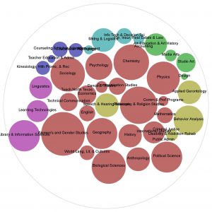 To create this graphic, I separated my data into columns listing the college, department, and percent of faculty with contributions in Scholarly Works. I also formatted the column of percentages to show the values without the percentage sign so that RAW would read the value as a number, and not a string. To populate the graphics, I had each circle represent a separate department, with the size of each circle increase to show the percentage of participating faculty. Larger circles show departments with a larger percentage of participants, and smaller circles show departments with fewer participating faculty. However, each department’s circle is color-coded by College.
This allows me to easily see if a college has a lot of high-participation departments or if it has a mix of high and low-participation departments. Rather than use a bar graph to compare across the board by the percentages of participation, circle-packing allows me to glance at everything and immediately understand the makeup by color to understand their relationship to each college, and by size to understand levels of participation. By far, the College of Arts & Sciences has the most high-participating departments, but color-coding these by college allows me to see that the College of Information and College of Public Affairs & Community Services also has high-participation departments, even if the college as a whole does not have a high rate of participation. This graphic also helps me identify low-participation departments, regardless of college, for a better picture of points for recruitment across the university.
Pamela Andrews
Repository Librarian
To create this graphic, I separated my data into columns listing the college, department, and percent of faculty with contributions in Scholarly Works. I also formatted the column of percentages to show the values without the percentage sign so that RAW would read the value as a number, and not a string. To populate the graphics, I had each circle represent a separate department, with the size of each circle increase to show the percentage of participating faculty. Larger circles show departments with a larger percentage of participants, and smaller circles show departments with fewer participating faculty. However, each department’s circle is color-coded by College.
This allows me to easily see if a college has a lot of high-participation departments or if it has a mix of high and low-participation departments. Rather than use a bar graph to compare across the board by the percentages of participation, circle-packing allows me to glance at everything and immediately understand the makeup by color to understand their relationship to each college, and by size to understand levels of participation. By far, the College of Arts & Sciences has the most high-participating departments, but color-coding these by college allows me to see that the College of Information and College of Public Affairs & Community Services also has high-participation departments, even if the college as a whole does not have a high rate of participation. This graphic also helps me identify low-participation departments, regardless of college, for a better picture of points for recruitment across the university.
Pamela Andrews
Repository Librarian


Leave a Reply