As part of the series on accessibility, it is a good idea to look at transferable information– in this case fonts. Now, regardless of what Microsoft Suite application, PDF editing software, or website builder the number of fonts one has available is staggering. However, not all should be used, if the goal is accessibility to audience members with assistive technology. Under Title II of the ADA and 508 Compliance guidelines there are fonts that should be used, Sans Serif, and those you should avoid or use sparingly, Serif and Decorative.
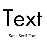
Sans Serif fonts are those that are don’t have those extra strokes at the end of letters. These are easier for screen readers to distinguish each letter.
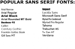
For this reason these popular fonts are preferred in accessible texts.
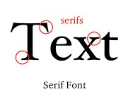
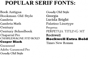
For those needing to use decorative fonts or serif fonts (many professors prefer Times New Roman, and even style guidelines frequently call for it). They can complicate the use of screen readers, in they can misread words especially if the letters in serif fonts are close together.
If there is reason to use a serif font without changing it to sans serif font, and you are concerned about screen reader issues try expanding the character spacing. This is done by:
Font > Advanced Tab > Spacing > Expanded (usually 1 pt works, but it is possible to go up well over 200 pts, in one tenth pt increments).
There are many possible decorative fonts available, and these should not be used in accessible projects. However, if they are (for say a title in a PowerPoint presentation) then the text needs to be at least 20 pt or higher. Also be aware that and let your readers know that they are there, where, and that the screen reader may experience unreliable reading of this text.
One other area to address is that of foreign language fonts. These can be especially tricky to deal with for creators and users, especially with screen readers. One of the best methods I have found when dealing with Latin and Cyrillic alphabets is to use Andika. This is a sans serif, Unicode-compliant font designed especially for literacy use. They also have character set support which makes referencing very easy.
For the most things, in English, my favorite sans fonts are Century Gothic, Arial, and Franklin Gothic Book. When serif is needed my top three are Times New Roman, Bookman Old Style, and Book Antigua. The important thing is to make it accessible as possible, but never forget to have a bit of fun too. Sometimes just “playing around” with font styles, spacing, and size can make a project come alive in unexpected ways.


Sean 'LeSean' G Lockridge
thank y’all