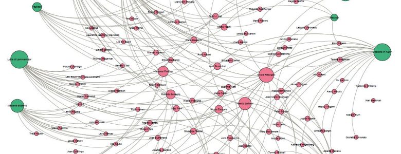
 Author: Maristella Feustle Many of us have been doing basic visualizations of quantitative data since elementary school, turning numerical information into charts and graphs. Somewhere along the line, most of us have also encountered Venn diagrams for visualizing conceptual relationships and attributes held in common between entities. But when we think of visualization, quantitative visualizations… Read more »
As part of the series on accessibility, it is a good idea to look at transferable information– in this case fonts. Now, regardless of what Microsoft Suite application, PDF editing software, or website builder the number of fonts one has available is staggering. However, not all should be used, if the goal is accessibility to… Read more »
RAWGraphs offers hexagonal binning as an option for representing dispersions in datasets with an exceptionally large number of data points. This visualization visually clusters the most populated areas on a gridded surface and assigns a color based on the number of points in the region. This example uses a public data set from Kaggle of data… Read more »
A dendrogram is a tree diagram that is usually used for showing taxonomic relationships, but any data that lends itself to hierarchical data clustering can be displayed using a dendrogram. RAWGraphs offers two variations on dendrograms: the circular dendrogram and the cluster dendrogram. I had some fun playing around with different data sets to provide examples… Read more »
A treemap is a space-filling visualization for displaying weighted hierarchical data using nested rectangles. The rectangles can be coded by color and size to show patterns that may be difficult to visualize in other ways. RAWGraphs give the user the option of incorporating as many colors into the visualization as they like, making it easy… Read more »
The Delaunay Triangulation is another visualization available through RAWGraphs that can be used to represent dispersions. The visualization creates a planar, triangular mesh for a given set of points. For the following example, I downloaded a public data set from Kaggle of data from 5000+ movies on IMDB. I refined the data set and decided… Read more »
RAWGraphs is an open source data visualization framework that strives to make the visual representation of complex data easy for everyone. The source provides step by step instructions for uploading data and creating unique, aesthetically pleasing visualizations that tell stories and make arguments using data in new ways. There are several options available, depending on… Read more »
Author: Maristella Feustle Many of us have been doing basic visualizations of quantitative data since elementary school, turning numerical information into charts and graphs. Somewhere along the line, most of us have also encountered Venn diagrams for visualizing conceptual relationships and attributes held in common between entities. But when we think of visualization, quantitative visualizations… Read more »
As part of the series on accessibility, it is a good idea to look at transferable information– in this case fonts. Now, regardless of what Microsoft Suite application, PDF editing software, or website builder the number of fonts one has available is staggering. However, not all should be used, if the goal is accessibility to… Read more »
RAWGraphs offers hexagonal binning as an option for representing dispersions in datasets with an exceptionally large number of data points. This visualization visually clusters the most populated areas on a gridded surface and assigns a color based on the number of points in the region. This example uses a public data set from Kaggle of data… Read more »
A dendrogram is a tree diagram that is usually used for showing taxonomic relationships, but any data that lends itself to hierarchical data clustering can be displayed using a dendrogram. RAWGraphs offers two variations on dendrograms: the circular dendrogram and the cluster dendrogram. I had some fun playing around with different data sets to provide examples… Read more »
A treemap is a space-filling visualization for displaying weighted hierarchical data using nested rectangles. The rectangles can be coded by color and size to show patterns that may be difficult to visualize in other ways. RAWGraphs give the user the option of incorporating as many colors into the visualization as they like, making it easy… Read more »
The Delaunay Triangulation is another visualization available through RAWGraphs that can be used to represent dispersions. The visualization creates a planar, triangular mesh for a given set of points. For the following example, I downloaded a public data set from Kaggle of data from 5000+ movies on IMDB. I refined the data set and decided… Read more »
RAWGraphs is an open source data visualization framework that strives to make the visual representation of complex data easy for everyone. The source provides step by step instructions for uploading data and creating unique, aesthetically pleasing visualizations that tell stories and make arguments using data in new ways. There are several options available, depending on… Read more »

