The Delaunay Triangulation is another visualization available through RAWGraphs that can be used to represent dispersions. The visualization creates a planar, triangular mesh for a given set of points. For the following example, I downloaded a public data set from Kaggle of data from 5000+ movies on IMDB. I refined the data set and decided to look only at movies from 2014.
The Delaunay Triangulation only requires two fields: the x-axis and y-axis, both consisting of numbers or dates. In order to demonstrate the visualization, I chose to show the relationship between movie budget (x-axis) and gross revenue (y-axis). The result is shown below:
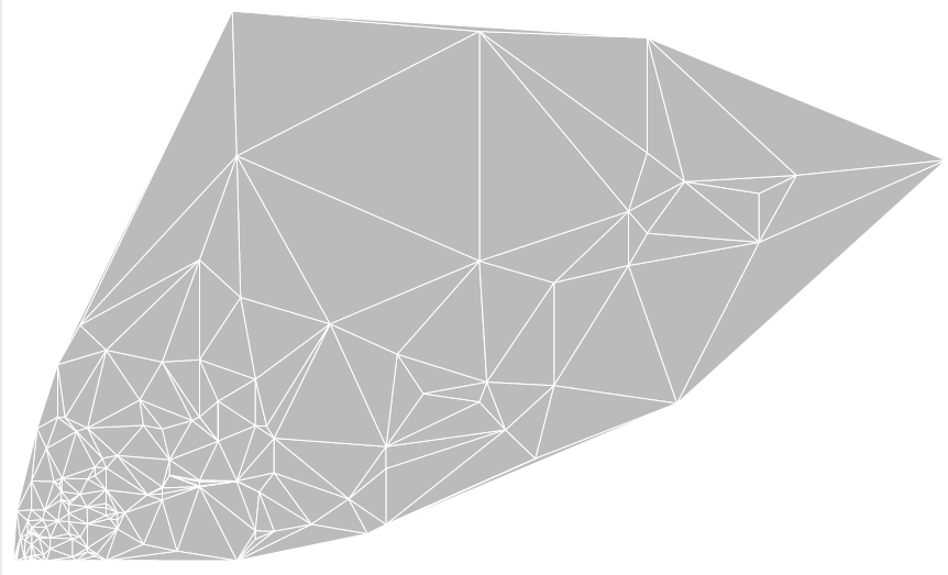 This type of visualization shows the correlations are present in a set of data. For instance, there seems to be a positive correlation in terms of money spent and money earned up to a certain point, after which the correlation plateaus.
It is important to provide some context when using this visualization, as there are no labels on the axes or data points, nor is there an option to add them. However, general trends in data are represented well using the Delaunay Triangulation, making it useful for all types of data sets.
This type of visualization shows the correlations are present in a set of data. For instance, there seems to be a positive correlation in terms of money spent and money earned up to a certain point, after which the correlation plateaus.
It is important to provide some context when using this visualization, as there are no labels on the axes or data points, nor is there an option to add them. However, general trends in data are represented well using the Delaunay Triangulation, making it useful for all types of data sets.


Leave a Reply