RAWGraphs is an open source data visualization framework that strives to make the visual representation of complex data easy for everyone. The source provides step by step instructions for uploading data and creating unique, aesthetically pleasing visualizations that tell stories and make arguments using data in new ways.
There are several options available, depending on the type of data you have and the arguments you are trying to make. We will take some time to look at each type of visualization and provide some examples of ways to use it.
The first visualization available is the Convex Hull. It is used to represent dispersions in data by displaying convex shapes containing a set of points. The visualization is overlaid on top of a scatterplot, making it useful at identifying points belonging to the same category.
Using sample data provided by RAW, we’ve displayed various stats of movies, including their production budget (x-axis), total domestic box office earnings (y-axis), and their rating on IMDB.
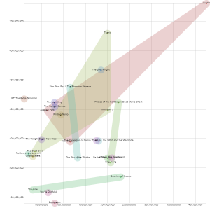 By choosing to display this data using a Convex Hull visualization, we can show the relationship between the amounts of money spent producing a movie and how much the movie grossed in the box office. We also see an interesting relationship when we group the movies by IMDB rating. Perhaps the most dramatic relationship we see is that Avatar received the same rating as Jurassic Park and Monsters, Inc., despite the fact that much more was spent in production.
A Convex Hull is just one of the many data visualization options available through RAW. Be on the lookout for our next post on the Delaunay Triangulation!
By choosing to display this data using a Convex Hull visualization, we can show the relationship between the amounts of money spent producing a movie and how much the movie grossed in the box office. We also see an interesting relationship when we group the movies by IMDB rating. Perhaps the most dramatic relationship we see is that Avatar received the same rating as Jurassic Park and Monsters, Inc., despite the fact that much more was spent in production.
A Convex Hull is just one of the many data visualization options available through RAW. Be on the lookout for our next post on the Delaunay Triangulation!


Leave a Reply