RAWGraphs offers hexagonal binning as an option for representing dispersions in datasets with an exceptionally large number of data points. This visualization visually clusters the most populated areas on a gridded surface and assigns a color based on the number of points in the region.
This example uses a public data set from Kaggle of data from 5000+ movies on IMDB. The x-axis shows IMDb movie ratings, and the y-axis displays gross revenue. Because there are so many data points in this set, it may be difficult to visualize the data in a clear and coherent way. However, hexagonal binning simplifies the data by clustering and color-coding it.
After setting up the visualization, this is what RAW gave me:
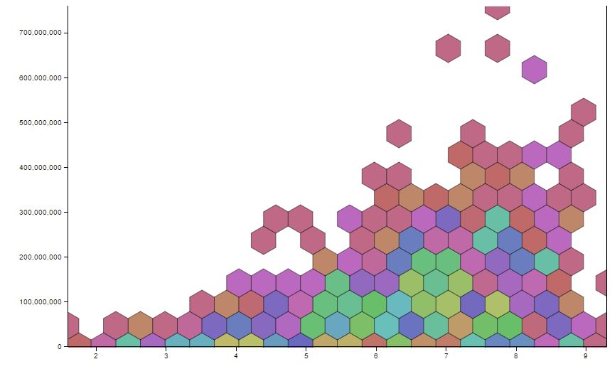 Because RAW randomly assigns colors for each cluster, this visualization does not mean a whole lot to someone looking at it for the first time, especially without a lengthy key explaining how many data points are contained in each hexagon by color. RAW also offers the option of displaying the visualization using a linear (numeric) color scale, in which case I get something that looks like this:
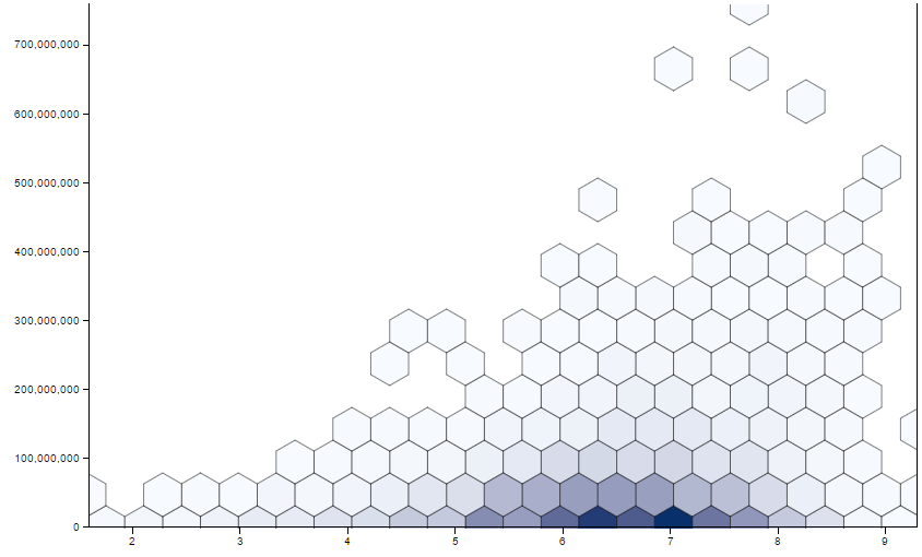 This looks better, but it is still not great in terms of detail. I can see where the most populated areas are but after that, everything looks pretty much the same. So, I thought this was the perfect opportunity to use a color palette tool!
I used my favorite tool, iWantHue, to select a color palette based on a single color. The tool provided me with 40 different HEX codes that I could sort by brightness, starting with the dark colors and ending with the lightest colors. Then I plugged the codes into the key in RAW and got the following visualization:
This looks better, but it is still not great in terms of detail. I can see where the most populated areas are but after that, everything looks pretty much the same. So, I thought this was the perfect opportunity to use a color palette tool!
I used my favorite tool, iWantHue, to select a color palette based on a single color. The tool provided me with 40 different HEX codes that I could sort by brightness, starting with the dark colors and ending with the lightest colors. Then I plugged the codes into the key in RAW and got the following visualization:
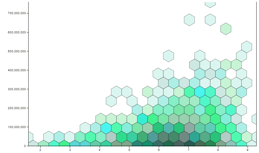 In this case, color makes a big difference! I can now see that the darker regions are areas with more data points and the lighter regions have the fewest number of data points. This concept is much easier to explain to an audience than showing them a huge legend and asking them to interpret it.
This case provides an excellent example of how different open source tools can be combined to create unique and meaningful visualizations of data. There are so many tools available and countless ways to use them. Get out there and give it a try!
In this case, color makes a big difference! I can now see that the darker regions are areas with more data points and the lighter regions have the fewest number of data points. This concept is much easier to explain to an audience than showing them a huge legend and asking them to interpret it.
This case provides an excellent example of how different open source tools can be combined to create unique and meaningful visualizations of data. There are so many tools available and countless ways to use them. Get out there and give it a try!


Leave a Reply