Alluvial Diagrams represent flows and show correlations between categorical dimensions over time. This option visually links the number of elements sharing the same categories and is useful to see the evolution of clusters (such as the number of people belonging to a specific group).
The user is provided quite a bit of freedom when using the alluvial diagram through RAWGraphs. You can incorporate as many steps as you like, consisting of numbers, strings, or dates. The interface also allows you to choose your own colors, or you can use the ones that are automatically selected.
Last semester, we worked with some data from the Museum of Modern Art to play around with this visualization. The data provided the names of the directors and department heads of the museum from the 1930s to the present. We thought it would be interesting to see where these people completed their education and if there were any relationships between their institution and the department with which they were involved. Using resources including Wikipedia and the MoMA website itself, we were able to fill in the institutions for each of the individuals on the list (surprisingly, several of the directors and department heads don’t appear to have terminal degrees). We then uploaded this data into RAW and found that the alluvial diagram did a wonderful job of showing some strong relationships:
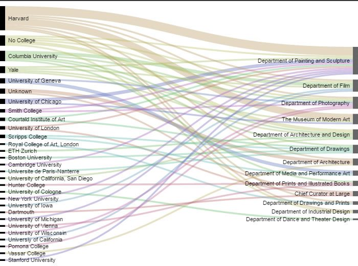 This representation strongly suggests that if you would like a job at the Museum of Modern Art, especially in the department of Painting and Sculpture, you might consider attending Harvard. It also provides a little bit of insight into the hiring trends of each department. It is clear that some departments, such as the Department of Media and Performance Art, tend to hire more from certain institutions (The University of Geneva) than others. Illustrating this information over time with a bump chart or possibly an animated viz would further illuminate these trends, but the alluvial diagram is suggestive and offers prompts for potential further inquiry.
For this example, we only incorporated two steps: institution and department, but it would be interesting to see what other relationships we could show. With more research and more data refining, we may be able to see how specific degrees and level of education related to each individual’s position in the MoMA.
Look out for more posts on the visualizations available through RAWGraphs!
Special shout out to Jeremy Singer-Vine for his rad weekly curated newsletter of open data sets “Data Is Plural,” where we discovered the MOMA data.
This representation strongly suggests that if you would like a job at the Museum of Modern Art, especially in the department of Painting and Sculpture, you might consider attending Harvard. It also provides a little bit of insight into the hiring trends of each department. It is clear that some departments, such as the Department of Media and Performance Art, tend to hire more from certain institutions (The University of Geneva) than others. Illustrating this information over time with a bump chart or possibly an animated viz would further illuminate these trends, but the alluvial diagram is suggestive and offers prompts for potential further inquiry.
For this example, we only incorporated two steps: institution and department, but it would be interesting to see what other relationships we could show. With more research and more data refining, we may be able to see how specific degrees and level of education related to each individual’s position in the MoMA.
Look out for more posts on the visualizations available through RAWGraphs!
Special shout out to Jeremy Singer-Vine for his rad weekly curated newsletter of open data sets “Data Is Plural,” where we discovered the MOMA data.


Leave a Reply