This year at The Digital Public Library of America (DPLA) Fest 2017 in Chicago, I had the opportunity to attend the Making the Case for Sustaining Your Digital Library Workshop. The workshop was hosted by two employees of the Foundation Center and was sponsored by a grant from the Knight Foundation.
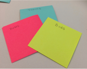
The large group of us gathered in Chicago Public Library’s Harold Washington Library Center as a part of Hubs the day before the conference. The workshop participants were led through helpful activities and discussions, given grant-seeking insider knowledge, and had time to practice using the methods. We also brainstormed ideas to help us better communicate and build relationships with potential funders. One activity I enjoyed was called Roses, Thorns, and Buds wherein participants were asked to write down on colorful post-it notes the Positives (Roses), Challenges (Thorns), and Opportunities (Buds) for the projects we were looking to sustain. Group members then clustered the ideas to identify trends that were both plaguing and encouraging across our institutions.
Read more
When I was asked within hours of becoming employed as the Collaborative Programs Graduate Assistant at UNT to work at a Data Rescue event, I had virtually no idea what I would be doing or how I could contribute to something like rescuing data. While familiar with general computer use, hearing “Data Rescue” implied a level of technical ability that felt beyond my expertise. However, I would soon learn that the Data Rescue initiative provides opportunities for people at all technical levels to contribute their skills. Specifically, I found my opportunity in telling the Data Rescue story.Read more
A dendrogram is a tree diagram that is usually used for showing taxonomic relationships, but any data that lends itself to hierarchical data clustering can be displayed using a dendrogram. RAWGraphs offers two variations on dendrograms: the circular dendrogram and the cluster dendrogram. I had some fun playing around with different data sets to provide examples of these two visualizations.
A circular, or radial cluster, dendrogram starts with more general classifications at the center and fans out to more specific classifications at the extremities. RAW give the user the option of using as many hierarchical steps as they want, and these can be in the form of strings, numbers, or dates.
I found a dataset from Kaggle that classified different Pokémon based on their type or types. I used the circular dendrogram to display this data, starting with their first type in the center and fanning out to their second type (if they had one) and then their name.
Read more
Exploring the Edges, Pushing the BoundariesCall for Poster & Infographic Proposals: Digital Frontiers 2017
September 21-23, 2017 | University of North Texas
Digital Frontiers is an annual conference that explores advances and new research in humanities and cultural memory through the lenses of digital scholarship, technology, and multidisciplinary discourse. The conference recognizes creativity and collaboration across academic disciplines by bringing together researchers, students, librarians, archivists, genealogists, historians, information and technology professionals, and scientists.
The Digital Frontiers program committee invites poster & infographic proposals for the 2017 conference (September 21-23). The program committee encourages imagination and originality in programming proposals and promotes the inclusion of student research. Proposals may be for:
Posters
Poster proposals should be in the form of an abstract of no more than 250 words describing the topic to be presented. Please do not submit the final poster! Further guidelines and specifications will be provided upon acceptance.
A poster that presents a central hypothesis, research methodology, and outcomes in a clear, visually-appealing format.
Posters should offer a general summary of your findings and main points, and may be accompanied by a brief talk.
Recommended size 36 x 48, please include the estimated size of your submission in the proposal if it exceeds the recommended size.
Infographics
Infographic submissions should include a 250 word description of the visualization including the methods, tool(s), dataset, and/or purpose, and an optional near-final version of the complete infographic if available (drafts are not required at submission).
An infographic that offers a single, informative visual image, or series of images, that represents data or information pertinent to your central research question(s).
The infographic should contain all of the information necessary for understanding your argument or main point.
Recommended size no less than 600 x 600 pixels to no more than 600 x 4800 pixels.
Proposals will be peer reviewed, with final decisions made by the program committee.
The deadline for submissions is June 30, 2017. View the complete call here.Notifications will be the week of July 15th.
Please email digitalfrontiers@unt.edu if you have questions.
Video games stand as an utterly unique medium in today’s world. Nothing else comes close to what they offer and what they achieve. No other medium involves the same level of artistic interactivity and audience-driven design. It is for this reason that both ludological and narratological studies fundamentally fail in regards to video games; they are both forms of study based on preexisting mediums. Ludology, the study of games as games, fails because it lacks the recognition of video games as story driven and containing more than just a series of game rules and mechanics. And narratology, the study of narrative, fails because it principally denies the idea that narrative can be in any way interactive, which is a fundamental basis of video games. To say that either approach holistically describes a proper study and understanding of video games is simply not valid. Now, this isn’t to say that certain elements of these studies can’t be used or adapted to better understand and interpret video games and video game design. There’s no need to reinvent the wheel here, and this is evident by seeing and analyzing the common patterns that video games hold between these two schools of thought. And so here we start with narrative.
Read more
Alluvial Diagrams represent flows and show correlations between categorical dimensions over time. This option visually links the number of elements sharing the same categories and is useful to see the evolution of clusters (such as the number of people belonging to a specific group).
The user is provided quite a bit of freedom when using the alluvial diagram through RAWGraphs. You can incorporate as many steps as you like, consisting of numbers, strings, or dates. The interface also allows you to choose your own colors, or you can use the ones that are automatically selected.
Last semester, we worked with some data from the Museum of Modern Art to play around with this visualization. The data provided the names of the directors and department heads of the museum from the 1930s to the present. We thought it would be interesting to see where these people completed their education and if there were any relationships between their institution and the department with which they were involved. Using resources including Wikipedia and the MoMA website itself, we were able to fill in the institutions for each of the individuals on the list (surprisingly, several of the directors and department heads don’t appear to have terminal degrees). We then uploaded this data into RAW and found that the alluvial diagram did a wonderful job of showing some strong relationships:
This representation strongly suggests that if you would like a job at the Museum of Modern Art, especially in the department of Painting and Sculpture, you might consider attending Harvard. It also provides a little bit of insight into the hiring trends of each department. It is clear that some departments, such as the Department of Media and Performance Art, tend to hire more from certain institutions (The University of Geneva) than others. Illustrating this information over time with a bump chart or possibly an animated viz would further illuminate these trends, but the alluvial diagram is suggestive and offers prompts for potential further inquiry.
For this example, we only incorporated two steps: institution and department, but it would be interesting to see what other relationships we could show. With more research and more data refining, we may be able to see how specific degrees and level of education related to each individual’s position in the MoMA.
Look out for more posts on the visualizations available through RAWGraphs!
Special shout out to Jeremy Singer-Vine for his rad weekly curated newsletter of open data sets “Data Is Plural,” where we discovered the MOMA data.
Teaching an ancient technology as part of a DH Maker Fair.
My job is weird.
I have a Ph.D. in English and “Professor” in my title, but I work in an academic library as a department head. I don’t have an MLIS. Currently I don’t have a DH project, as such, but I’ve been doing research about labor ethics and DH pedagogy, and about the relationship between DH and Linked Open Data for a few years. I’ve done researchabout research data. I’ve also done work on nineteenth century illustration and children’s literature, the bibliographic aspects of which inform my thinking about digital humanities. So my work has become, I suppose, meta-DH. And so a day in my DH life is a reflection on the community that helps me do this work.
By far the most important thing I’ve done in my time with UNT Libraries is the founding and directing ofDigital Frontiers. DF is an annual conference and THATCamp, and has become the largest and longest-running DH conference in the Southwest region. It’s also one of the few scholarly venues that actively encourages librarians and archivists, genealogists and lay historians, scholars and students to all come together to share their work. The net result of this, for me, is that the real product of the Digital Frontiers project is not the conference, but the community that has emerged from the conference. We have an active presence on Twitter, a lively Facebook group, and a monthly newsletter with an international readership, and contributions from all over. The organizing committee is made up of 26 individuals from 8 institutions including faculty, librarians, students, and paraprofessionals, representing public libraries and universities. This diversity of perspectives is essential to the project’s success and longevity. Read more
Denton, Texas has been home to a thriving music scene for decades, owing in large part to the consistent stream of talent and creativity which UNT’s music programs have attracted. The stories of many prominent performers are fairly common knowledge, including those of Norah Jones, Pat Boone, Roy Orbison, the One O’Clock Lab Band, and others, but the stories of the venues where they performed are generally much more obscure.
Geographic Information Systems (GIS) provide an interactive platform to tell some of those stories, collecting venue names and locations which are bound together with so many vivid memories of the Denton music scene over the years, including Jim’s Diner, Captain Nemo’s, and the Rock Bottom Lounge.
Clear centers of activity emerge — namely, the UNT campus, the Fry Street area, and historic Downtown Denton. The visual presentation of these venues provides tangible evidence of past and present creative activity in Denton, and shows continuity of the present scene with that of the storied past.
This project remains a work in progress with the discovery of additional former venues and the development of new ones. The continuous growth and change in Denton provides the promise of new centers of creative activity, and new places to make memories that will define the “good old days” of tomorrow.
Maristella Feustle
Music Special Collections Librarian
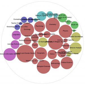
The UNT Scholarly Works collection is home to materials from the University of North Texas community’s research, creative, and scholarly activities. To encourage further participation by UNT community members, it’s helpful to know the degree to which different departments currently participate by depositing items in the collection. You can view who is contributing to the collection by browsing the collection through our contributing partners. However, this doesn’t immediately show their degree of participation.
To understand the degree of participation, I downloaded the list of creators from UNT Scholarly Works (using the UNT Digital Library API) and matched participants to a list of current faculty from the 2016-2017 academic year. Then I compared the number of participating faculty members to the total faculty within each department to understand the percentage of participating faculty in each department. By looking at percentages, I would have a better understanding of the department as a whole, and be able to more accurately compare larger departments against smaller ones.
This gave me a lengthy breakdown of participation by college and department, but it’s difficult to take in at a glance. To create a better visualization of this data, I turned to the RAW graphs tool. Using the circle-packing visualization, I created the graphic below.
Read more


 Read more
  Read more
 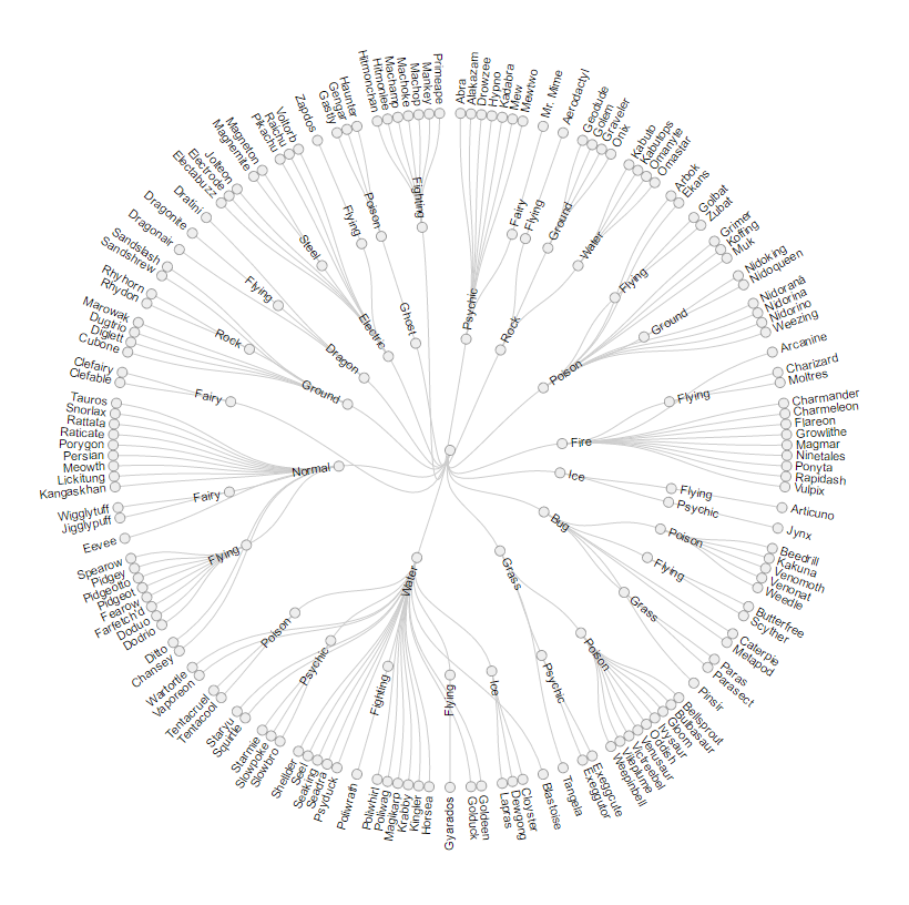 Read more
 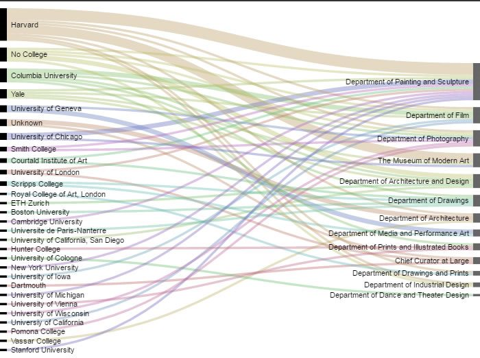 This representation strongly suggests that if you would like a job at the Museum of Modern Art, especially in the department of Painting and Sculpture, you might consider attending Harvard. It also provides a little bit of insight into the hiring trends of each department. It is clear that some departments, such as the Department of Media and Performance Art, tend to hire more from certain institutions (The University of Geneva) than others. Illustrating this information over time with a bump chart or possibly an animated viz would further illuminate these trends, but the alluvial diagram is suggestive and offers prompts for potential further inquiry.
For this example, we only incorporated two steps: institution and department, but it would be interesting to see what other relationships we could show. With more research and more data refining, we may be able to see how specific degrees and level of education related to each individual’s position in the MoMA.
Look out for more posts on the visualizations available through RAWGraphs!
Special shout out to Jeremy Singer-Vine for his rad weekly curated newsletter of open data sets “Data Is Plural,” where we discovered the MOMA data.
This representation strongly suggests that if you would like a job at the Museum of Modern Art, especially in the department of Painting and Sculpture, you might consider attending Harvard. It also provides a little bit of insight into the hiring trends of each department. It is clear that some departments, such as the Department of Media and Performance Art, tend to hire more from certain institutions (The University of Geneva) than others. Illustrating this information over time with a bump chart or possibly an animated viz would further illuminate these trends, but the alluvial diagram is suggestive and offers prompts for potential further inquiry.
For this example, we only incorporated two steps: institution and department, but it would be interesting to see what other relationships we could show. With more research and more data refining, we may be able to see how specific degrees and level of education related to each individual’s position in the MoMA.
Look out for more posts on the visualizations available through RAWGraphs!
Special shout out to Jeremy Singer-Vine for his rad weekly curated newsletter of open data sets “Data Is Plural,” where we discovered the MOMA data. 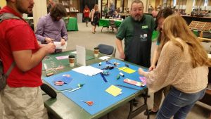
 Read more